Today, Apple released a software update for the Mac called Mojave. Here are some of the different things that I have enjoyed, so far, with the new update.
Dark mode


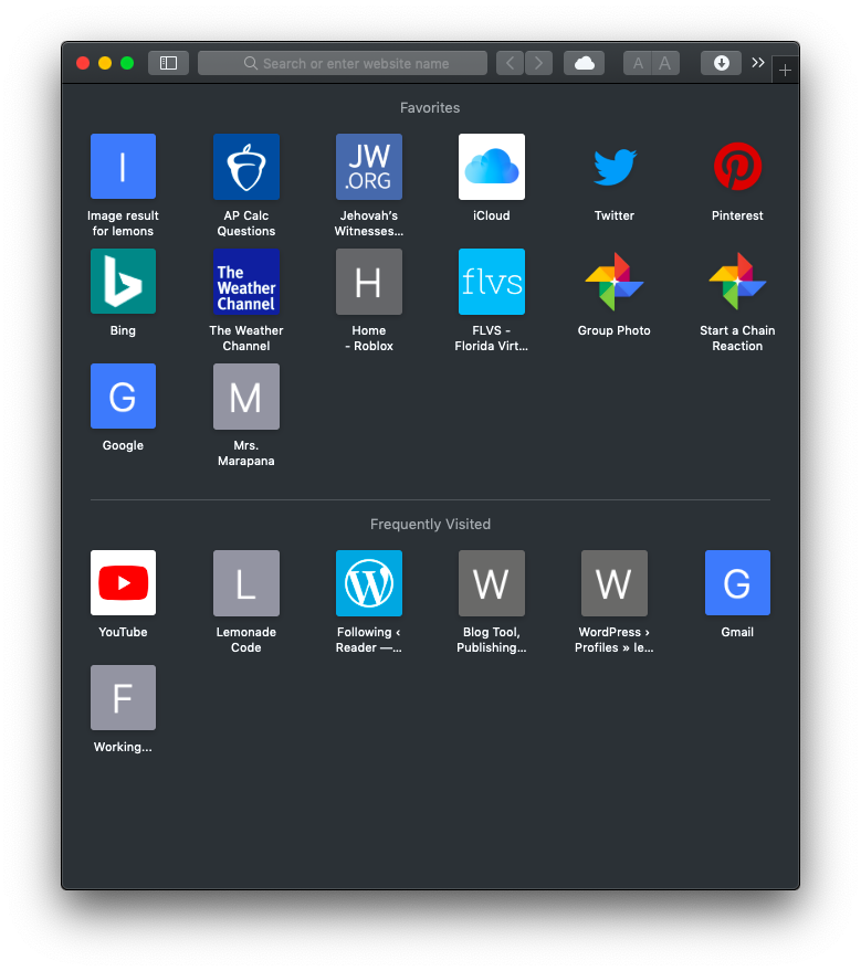
Honestly, Have been waiting for this moment. On the official apple website, it gives the example comparing the Dark Mode to the Light Mode. This will effect the apps:
- App Store
- System Preferences
- Safari
- Messages
- Contacts
- etc.
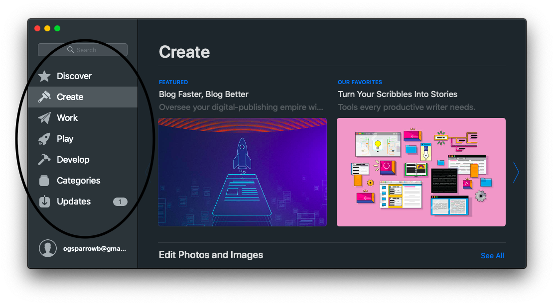
App Store Up-date


Finally, we get to see an update to the apple App Store for the Mac. With the pictures that are provided above, we get to see that it is not only for supporting the dark mode, it is also making it more like the App Store on the iOS devises.
Stacks


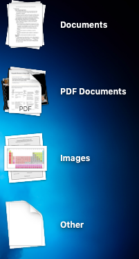
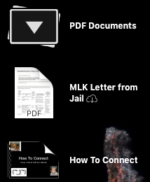
Inside of the new update, the stacks allow all of your files (on your desktop) to be organized by type. For example, some of the different types of stacks that you could have is
- Documents
- PDF documents
- Images
- Etc.
They could be really helpful for someone, like me, who saves everything to the desktop. This could be, and is, a really good solution even though you would have to do some “spring cleaning” once in a while.